Spending Accounts Page Redesign
UX / UI Design, Product Design
Benefits Communication, Product Education, Redesign
Kelowna, BC (Hybrid)
2025
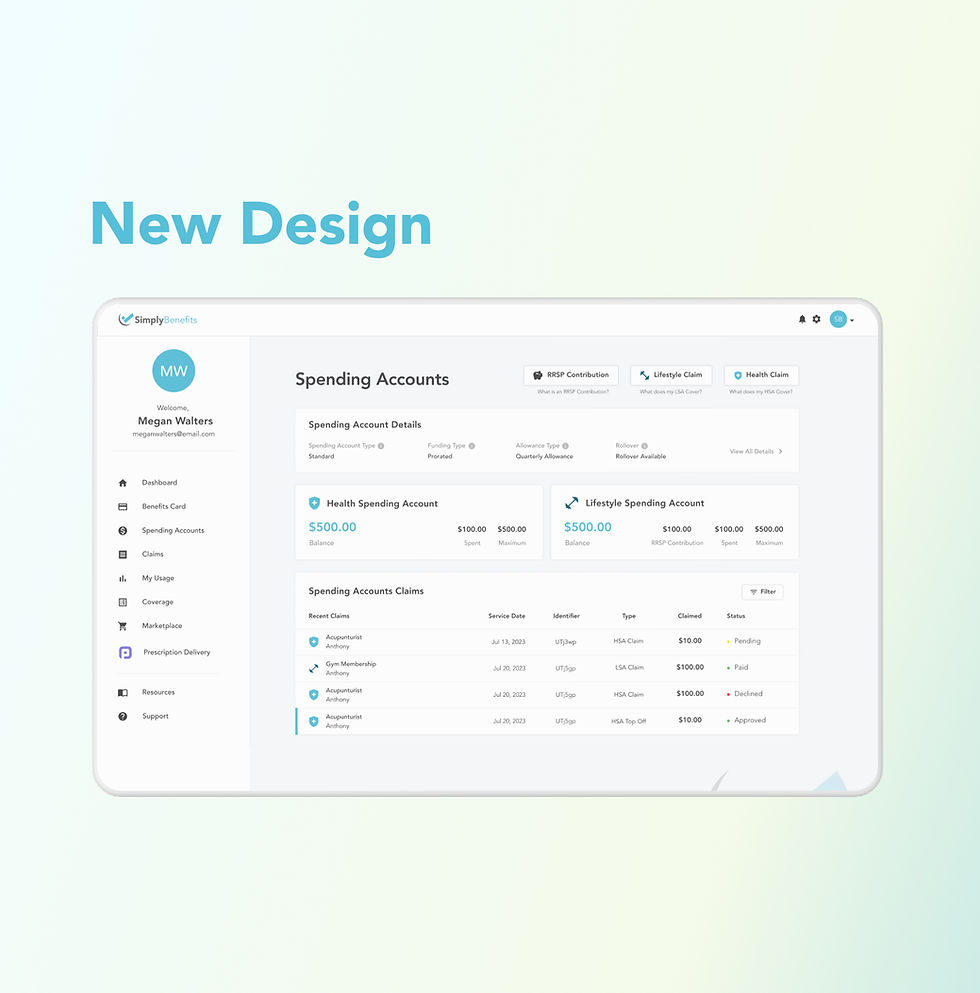
I redesigned the Spending Accounts page for Simply Benefits’ member portal and mobile app, making it easier for employees to understand how their accounts worked. The old design didn't have critical details like rollover rules and HSA/LSA coverage in cluttered layouts, and the circular “wheels” UI confused rather than clarified. The new design presents balances, rollover, and coverage information in a clear, scannable format while introducing filters and consistent layouts across web and mobile.
Summary
I created a modern Spending Accounts experience that simplified account information for members, highlighted important rules, and improved usability across devices. The redesign ensured employees could clearly see what accounts they had, what was covered, what rolled over, and their up-to-date balances—all while aligning with Simply’s design system.
Challenge
The old design failed to display critical details such as rollover eligibility, HSA coverage, or LSA coverage in an accessible way. The circular “wheels” UI for balances was visually striking but ultimately misleading and hard to interpret, leaving members uncertain about what the wheel/numbers meant. Claims history was buried in two dense tables with limited filtering or sorting options, and the mobile app mirrored these same issues, reducing transparency and creating unnecessary support burdens.
Solutions
To address these challenges, I completely restructured the information hierarchy so rollover, coverage type, and account balances appeared upfront and in plain language. The confusing wheels were replaced with direct, numeric account cards that members could trust, and the claims history was consolidated into a single, visually organized table rather than split across two separate ones. To improve coverage transparency, I added expandable sections and modals (such as “What does my LSA cover?”) that gave members context without overwhelming them. I also introduced filter and sort functionality for claims history, enabling users to quickly find transactions. Finally, I ensured cross-platform consistency by delivering parallel designs for web and mobile, while applying Simply’s design system to create a scalable and unified UI.